Distinctly Southern.
Fullsteam Classics Series
DURHAM, NORTH CAROLINA
"Fullsteam’s mission is to craft distinctly Southern beer that celebrates the farm and food traditions of the American South. We express our love for community and the land through the Southern Beer Economy. Through the act of commerce, our purchases (and yours) foster community and agricultural pride, create wealth, and encourage entrepreneurship within the post-tobacco South." - from fullsteam.ag
As the craft beer world consolidated (both in ownership, and on the retail shelf) between 2015 and 2020, Fullsteam began to restructure their large range of products, and experimented with an unusual (and unusually successful) production schedule. We identified products for which Fullsteam was very well known, but may or may not have been available when expected, due to the brewery’s enormous lineup and constant experimentation. These products would become the Fullsteam Classics Series - available either year-round or in 6-month cycles.
The creative direction took inspiration from three of Fullsteam’s longtime hero products, who would feature in the lineup alongside three formerly-limited-or-seasonal products. We hope you enjoy the results as much as we do.
SERVICES
Brand Strategy
Logos, Iconography + Lettering
Packaging Design
Brand Asset Evolution
CREDITS
Strategy + Creative Direction: Joshua Berman
Lettering: Jud Lively
Illustration: Kurt Lightner
Photography: Stacey Sprenz
“We’ve worked with Josh Berman of Berman Brand Group for a number of years, on a wide range of projects and products. What’s unique about Josh is his ability to think strategically - and to funnel that strategy into creative, clean deliverables.
It’s rare for an agency to seamlessly connect strategy, story, and product. Punch does this effortlessly. It’s why we keep coming back to Josh and his team for projects big and small. Bonus: he’s fun to work with and super nice! ”

Paycheck
As one of the longest-running Fullsteam products, adding it to the Fullsteam Classics series was foregone. The only formulation update was switching to 100% Tennessee-grown flaked corn, with no change in their fan-favorite flavor. And since it was likely the most recognizable of all Fullsteam brands, this script and top hat icon required the least amount of polish.
Todo Vapor
Three notable updates for this Durham staple, originally called “El Toro”: 1) entirely redesigned custom script, 2) fresh, energetic illustration, and 3) a new contrast color to complement the updated Fullsteam Classics palette. Todo Vapor’s new roasted orange takes inspiration from another famous Durham bull, but is more vibrant and saturated, to fit the rest of the series.
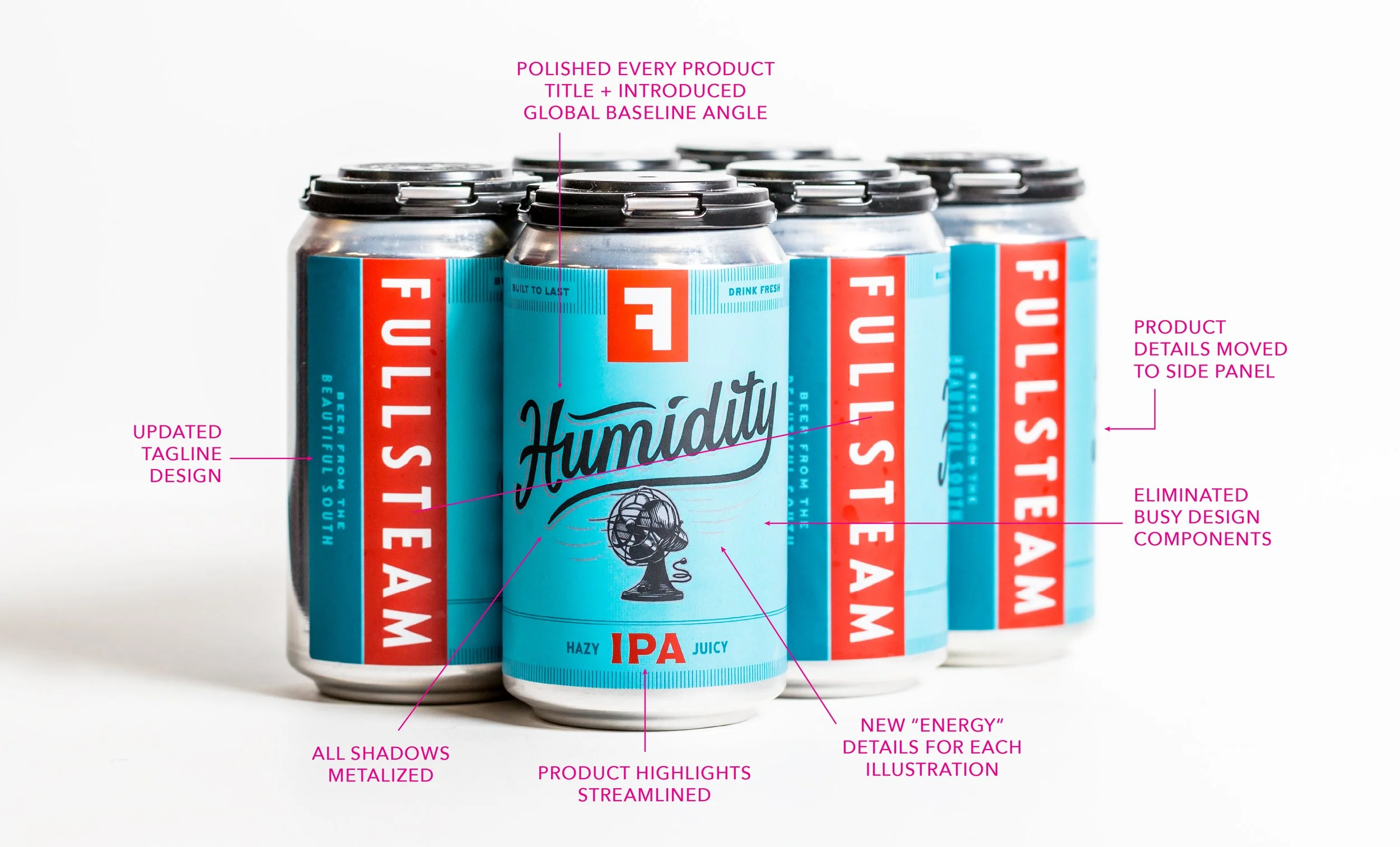
Humidity
This hazy IPA is a relatively recent addition to the Fullsteam catalog, but was an instant hit, largely replacing the long-running-but-late Cack-A-Lacky ginger pale ale. We had very minor improvements to make, mostly simplifying the “u-m” connection to make it a bit more legible at speed, and introducing a few more silver “energy” lines to connect the illustration with the family.
Road To Nowhere
The most recent addition of all the Fullsteam Classics, Road to Nowhere began its short-but-promising life as “Pine State” - a loving homage to the piney, west-coast IPAs of the early craft beer revolution at the end of the 20th century. After a brief stop as “The Road to Nowhere", we recommended dropping the article, focusing on the wild exploration quality of the beer’s story, rather than the trees specifically, and selected a vibrant green that separates it from the more blue-green of Rocket Science.
Kurt created a loving lantern icon, and Jud delivered a classic script from whole cloth.
Coffee Is For Closers
Fullsteam’s iced coffee porter is almost certainly their most famous (and well-loved) seasonal product, and she got a promotion with the launch of the Fullsteam Classics series. Coffee Is For Closers now available half the year, instead of just three months, and with a brand new job comes a brand new suit.
Kurt illustrated an appropriate keypad phone icon, and Jud delivered a classic script inspired by earlier runs’ typewriter face.
Rocket Science
Much like PayCheck, Rocket Science has been a workhorse of Fullsteam’s for a minute. The core design concept was great, and very memorable, so we simply polished up the script, put it on our universal baseline, and boosted our blueish-green a hair. We also emphasized the tittle over the “i” with slightly better alignment.

Brand Audit + Revision
Fullsteam’s logos and core brand components have been around for quite some time, but evolved slighty along the way. Beyond packaging design, part of this job was eliminating the use of outdated or superfluous brand elements, including logos, typefaces, or “crufty” design components.
This is not unusual - we are often called to cull the design wheat from the chaff, as it were, eliminating elements that accumulate over years and years. The results is a suite of assets that is incredibly punchy on the shelf, super consistent, and easier to deploy.
Sometimes a core brand concept is strong, carrying a degree of existing marketplace awareness. In that case, it is often prudent to polish the assets we have, bring the whole brand up to date and add components to strengthen the overall presentation. This can happen alongside a repositioning, or a change in price point, or the introduction of new products.
To discern the best course of action, Punch regularly performs a brand audit with our new partners.
Let’s work together to find the best solution for your brand.


